Where the good work came from
22 of 22 stories on view
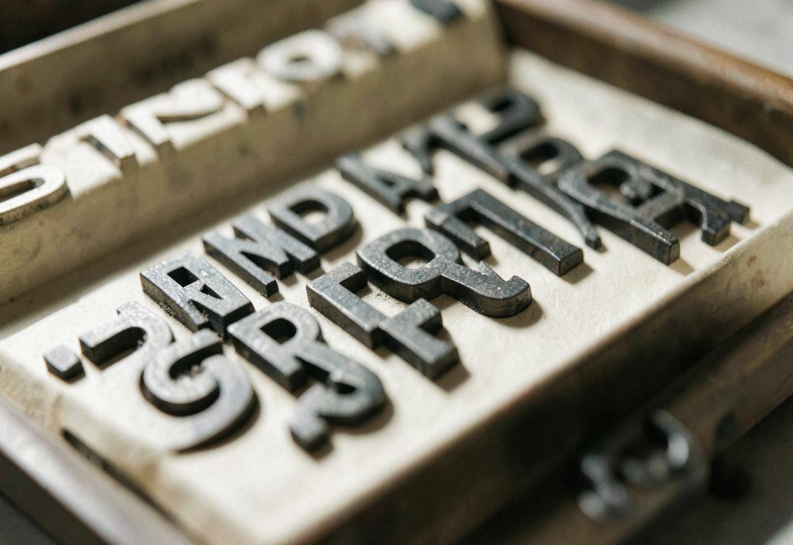 Typeface · 12 SEPT
The Penguin composition rules
Four pages of typographic law that shaped a century of paperbacks.
View plate →- MovementMovement · 11 SEPT
Swiss punk: the Basel counter-reaction
What happened when students in the home of the grid decided to break it.
View plate → 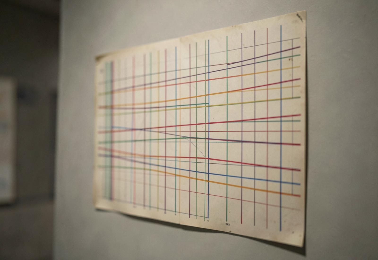 Historical Moment · 10 SEPT
Massimo Vignelli
The New York subway map that argued a city could be redrawn as a diagram — and the decade-long argument that followed.
View plate →- Brand IdentityBrand Identity · 09 SEPT
The Sony Walkman logotype
How a compound word became a category.
View plate → - DesignerDesigner · 08 SEPT
Wim Crouwel's New Alphabet
A typeface designed for machines that humans could barely read.
View plate → 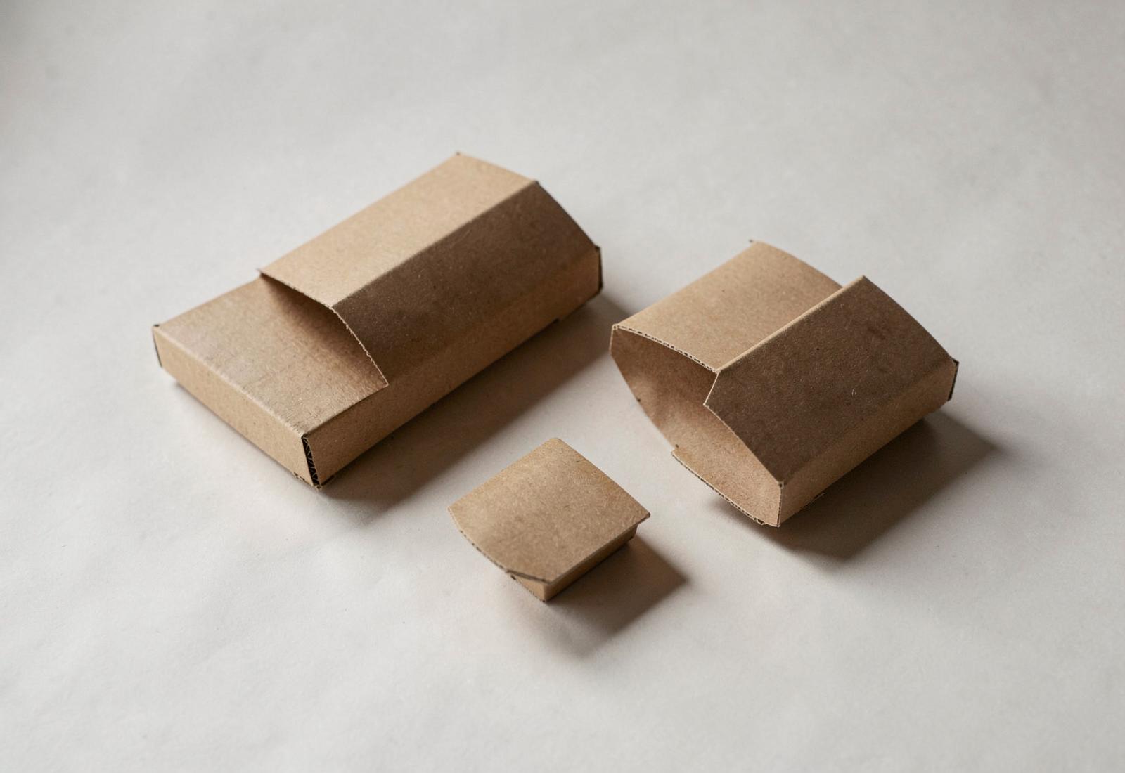 Brand Identity · 01 SEPT
Muji has no logo on its products
The name means "no-brand quality goods", and the packaging keeps the promise.
View plate → Design Fact · 31 AUG
Blue was the last colour to get a name
Across unrelated ancient languages, colour vocabulary appears in almost the same order.
View plate →- Logo · 30 AUG
The London Underground roundel
A red disc with a blue bar, standardised in 1919, still readable at any speed.
View plate → - Historical MomentHistorical Moment · 29 AUG
The Bauhaus ran for fourteen years
Three cities, three directors, one closure under political pressure in 1933.
View plate → - Typeface · 28 AUG
Gill Sans and the British railway
A humanist sans built on Roman inscription proportions became the voice of an entire country's infrastructure.
View plate → - DesignerDesigner · 27 AUG
Muriel Cooper's Visible Language Workshop
The MIT designer was building typography in three dimensions before anyone had a screen worth doing it on.
View plate → - Historical MomentHistorical Moment · 26 AUG
The first emoji set was 12 pixels square
Shigetaka Kurita drew 176 symbols in 1999 for a Japanese pager network.
View plate → - RebrandRebrand · 25 AUG
Airbnb's Bélo
A 2014 rebrand introduced a symbol so simple the internet spent a week finding other things it resembled.
View plate → - Design Fact · 24 AUG
The em dash is as wide as the type is tall
Its width has nothing to do with the letter M.
View plate → - Packaging · 23 AUG
Why milk cartons are gabled
The shape you have opened a thousand times was patented in 1915 and still beats the alternatives.
View plate → - Poster · 22 AUG
Josef Müller-Brockmann's concert posters
A series of posters for the Zurich Tonhalle turned musical structure into pure geometry.
View plate → - Object · 21 AUG
The Braun T3 pocket radio
Dieter Rams designed a radio in 1958 that reappeared, more or less exactly, as a music player in 2001.
View plate → - Movement · 20 AUG
The Memphis Group lasted five years
Ettore Sottsass built a movement out of laminate, terrazzo and colours nobody would put in a living room.
View plate → - Brand IdentityBrand Identity · 19 AUG
MTV's identity that refused to sit still
In 1981 a logo was supposed to be fixed. MTV's was designed to be vandalised.
View plate → - Logo · 18 AUG
The FedEx arrow
A piece of negative space between two letters became the most cited logo detail in the profession.
View plate → - TypefaceTypeface · 17 AUG
Helvetica was nearly called Neue Haas Grotesk
It kept its Swiss workshop name for two years before a marketing department intervened.
View plate → - Designer · 16 AUG
Paula Scher draws maps by hand
The Pentagram partner spends years filling canvases with hand-lettered geography nobody asked her to make.
View plate →