The whole library, in order.
- 13 SEPT 26
Draw a piece of toast as a brand mascot
Give it a posture, a personality and a name. It should look like it belongs on packaging, not on a napkin.
BriefIllustration / Branding30 minWARM UP
- 12 SEPT 26
A logo is a signature, not a story
The mark identifies. The system explains.
LessonBranding5 min read
- 12 SEPT 26
Create an album cover using exactly three circles
Three circles, any size, any colour from a two-colour palette. Add the artist name and album title. Nothing else may appear on the sleeve.
BriefComposition30 minSWEAT
- 12 SEPT 26
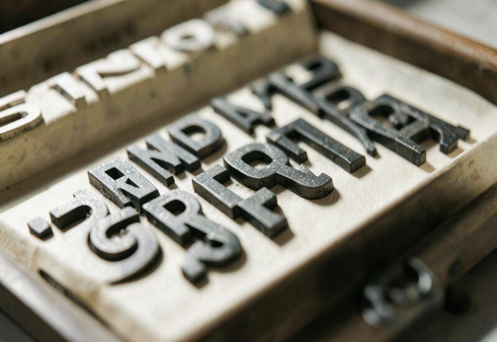
The Penguin composition rules
Four pages of typographic law that shaped a century of paperbacks.
StoryTypeface
- 11 SEPT 26
Colour has a temperature before it has a name
Warm and cool decide the mood long before the hue does.
LessonColour6 min read
- 11 SEPT 26
Design a book cover using typography only
No image, no texture, no illustration. The title, the author and the publisher's mark must do all the work of genre, tone and period.
BriefEditorial45 minSTRETCH
- 11 SEPT 26
Swiss punk: the Basel counter-reaction
What happened when students in the home of the grid decided to break it.
StoryMovement
- 10 SEPT 26
Optical spacing beats mathematical spacing
Why evenly measured letterspacing still looks wrong — and how to trust the eye over the ruler.
LessonTypography4 min read
- 10 SEPT 26
Make Helvetica feel rebellious
Take the most neutral typeface ever drawn and give it an attitude. No new typefaces, no illustration, no photography. You may crop, scale, repeat, rotate and overlap — nothing else…
BriefTypography / Composition35 minSTRETCH
- 10 SEPT 26
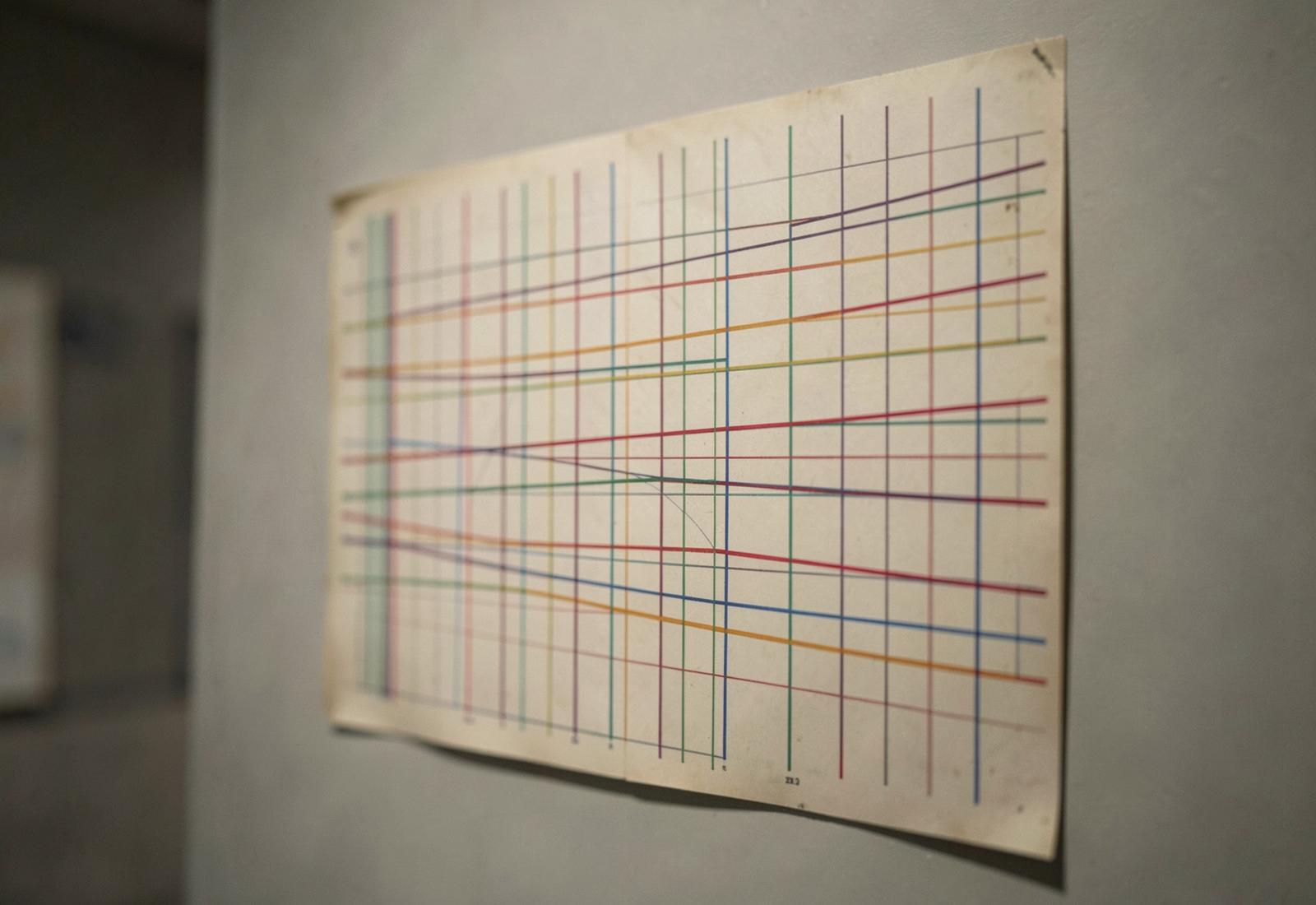
Massimo Vignelli
The New York subway map that argued a city could be redrawn as a diagram — and the decade-long argument that followed.
StoryHistorical Moment
- 09 SEPT 26
Hierarchy is subtraction
Most weak layouts are not missing emphasis. They have too much of it.
LessonComposition4 min read
- 09 SEPT 26
Create a logo using Cooper Black
Take a typeface with a strong personality and make it serve a brand that would never normally choose it. A law firm, a laboratory, a bank.
BriefBranding / Logo40 minSTRETCH
- 09 SEPT 26
The Sony Walkman logotype
How a compound word became a category.
StoryBrand Identity
- 08 SEPT 26
The grid is an argument, not a cage
A grid does not make a layout good. It makes a layout accountable.
LessonLayout5 min read
- 08 SEPT 26
Design a poster with one word
Choose a single word and build an entire A2 poster around it. The word must be legible from across a room and interesting from arm's length.
BriefTypography25 minWARM UP
- 08 SEPT 26
Wim Crouwel's New Alphabet
A typeface designed for machines that humans could barely read.
StoryDesigner
- 07 SEPT 26
Choose two typefaces, and know why
Pairing is not about contrast for its own sake. It is about giving each voice a job.
LessonTypography5 min read
- 07 SEPT 26
Set a poster in one weight
Design an A3 event poster using a single typeface at a single weight. All hierarchy must come from size, position and space — nothing else.
BriefTypography20 minWARM UP
- 06 SEPT 26
Negative space is the composition
Nothing on the page is not empty. It is the part that decides where the eye rests.
LessonComposition4 min read
- 06 SEPT 26
Rebuild a logo from memory
Pick a logo you see every day. Without looking at it, redraw it. Then compare and note every difference.
BriefBranding15 minWARM UP
- 05 SEPT 26
Rhythm: the invisible half of layout
Consistent vertical spacing is felt long before it is noticed.
LessonLayout4 min read
- 05 SEPT 26
Three greys and a signal
Compose a magazine spread using three greys and exactly one accent colour, used on less than a tenth of the page.
BriefColour30 minSTRETCH
- 04 SEPT 26
Easing is the tone of voice
Duration decides whether motion is noticed. Easing decides how it feels.
LessonMotion5 min read
- 04 SEPT 26
Grid of nine
Build a 3x3 grid and place a single photograph so it reads differently in three separate crops of the same frame.
BriefComposition35 minSTRETCH